

College football players come from all over, but not every region is equal in how many players it produces. Large swaths of the country produce very few FBS players, while some hotspots produce tons of them. There’s a lot of variance.
This month, Jake Sharpless of Rukkus published a heat map and some other goodies that demonstrate the geographic origins of every player in the country.
College football is America’s most sprawling sport. There are 128 teams, and that’s just at the country’s highest level of play, the Football Bowl Subdivision. There are tons more competing below FBS and thousands of more players that make them up.
With the season on the way, here are some maps and other visuals that explain how this sport operates and where its players originate.
Where recruits (including the best ones) come from
Here’s a heat map of every top-15 recruit’s hometown, from 2000 to 2017, using consensus rankings from the 247Sports Composite. This comes, initially, from our collection of 25 maps that explain college football.
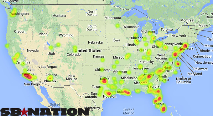
You’ll notice that more top-15 players are from three states – Florida, Texas and California – than anywhere else.
That’s not a coincidence. Four- and five-star recruits are packed into those states, with only a few others coming close to their levels of blue-chip talent.
Check the breakdown of state shares of blue-chip recruits over the last five years, and note how little this picture changes from year to year.
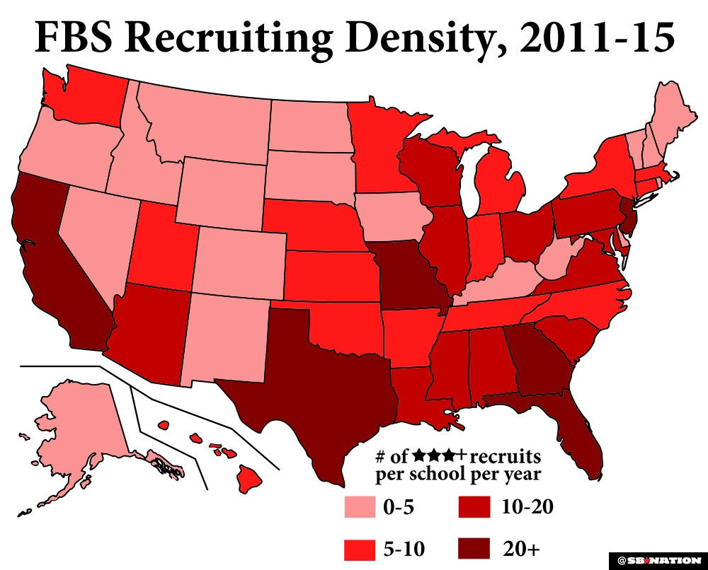
A map breakdown, including all three-star-or-better recruits in every state. This is recruiting density:
The home-state distribution of every single listed recruit in the country, from 2008 through 2013:
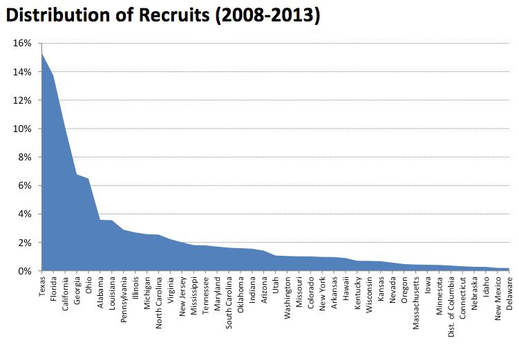
The Texan, Floridian and Californian share of the country’s total recruits isn’t all that different than their share of blue-chip players. There are just a lot of players there, in general.
Take a look at this picture Corn Nation, our Nebraska blog, put together, based on data from 2002 through 2014. It maps out every blue-chip signee’s college choice, with their college destinations placed in the form of college team logos atop their hometowns on the map.
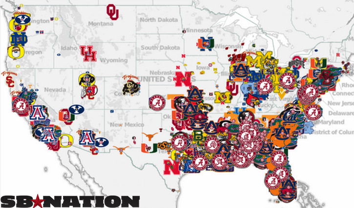
See all those Alabama and Clemson logos in the Southeast? It’s not a coincidence. Those Michigan logos in the Midwest? Also not a coincidence.
Oh, and there are alsoa bunch of punters and kickers from Australia.
College football players come from lots of places, but a few states create lots more of them than the rest. There’s a trickle-down effect, whether it’s from population effects, evaluators’ bias or superior player development, that leads to tons more blue-chip recruits also coming from those states. Mathematically, it fits. It makes sense.
It changes how the sport works. The greatest competitive advantages a college football program can have are money and easy access to good recruits. And how much access a team has depends, in large part, on its zip code.